Client
Swiss dental clinic
Scope
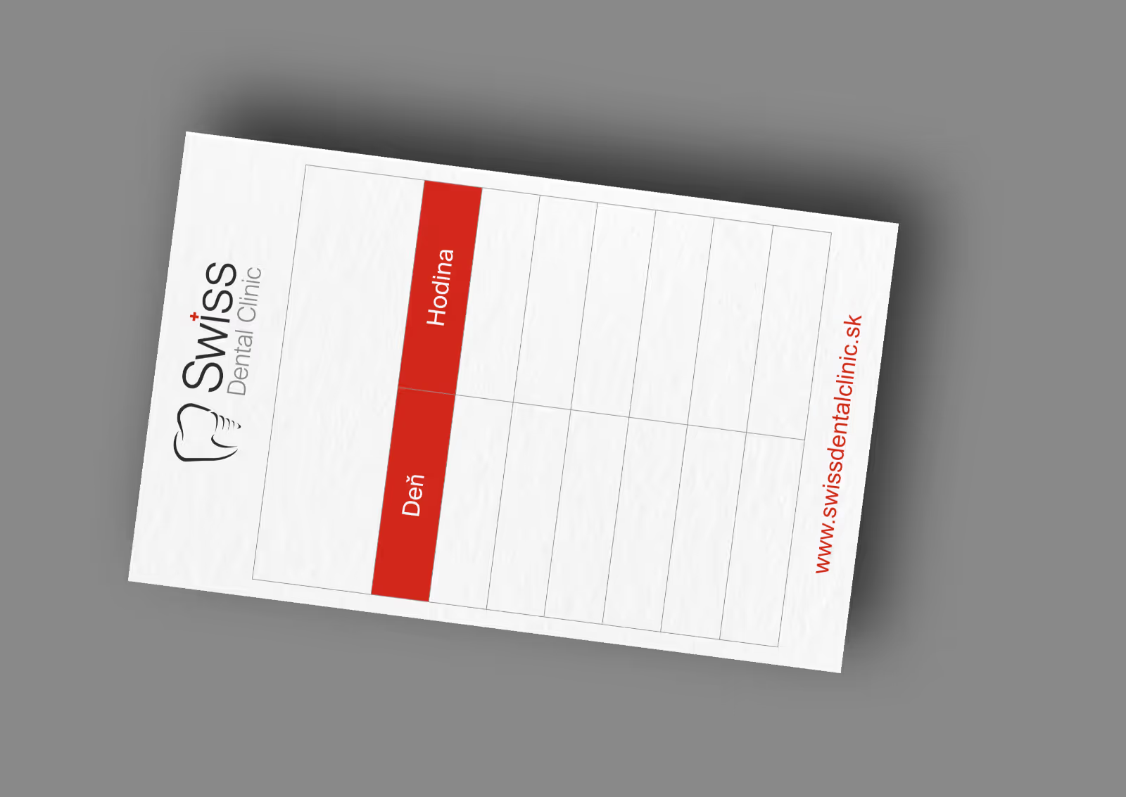
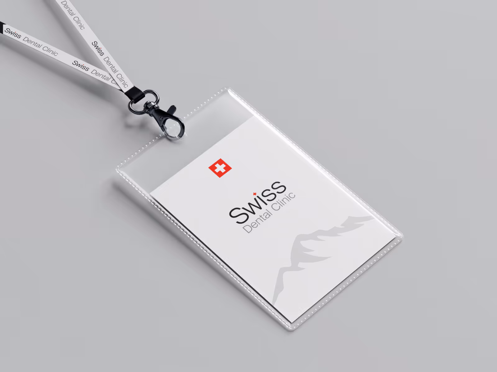
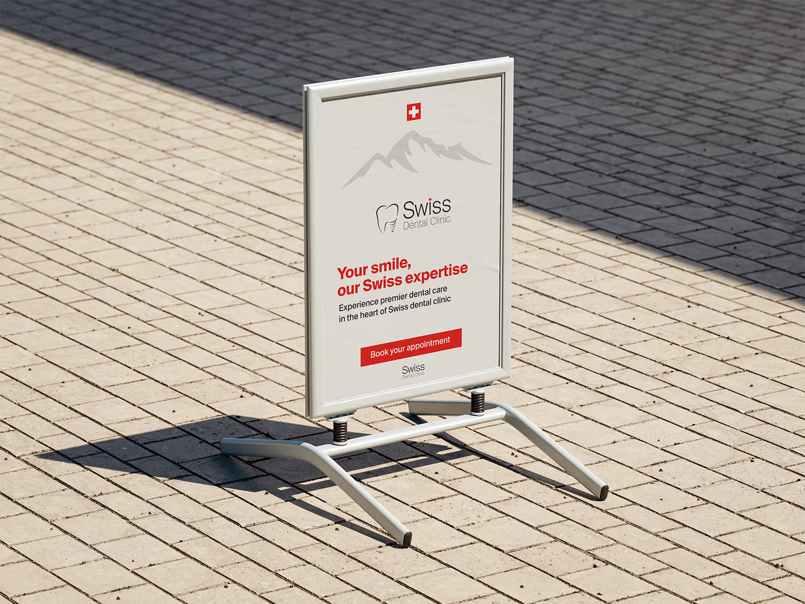
Brand identity - Logo design - Visual systems
Project goal
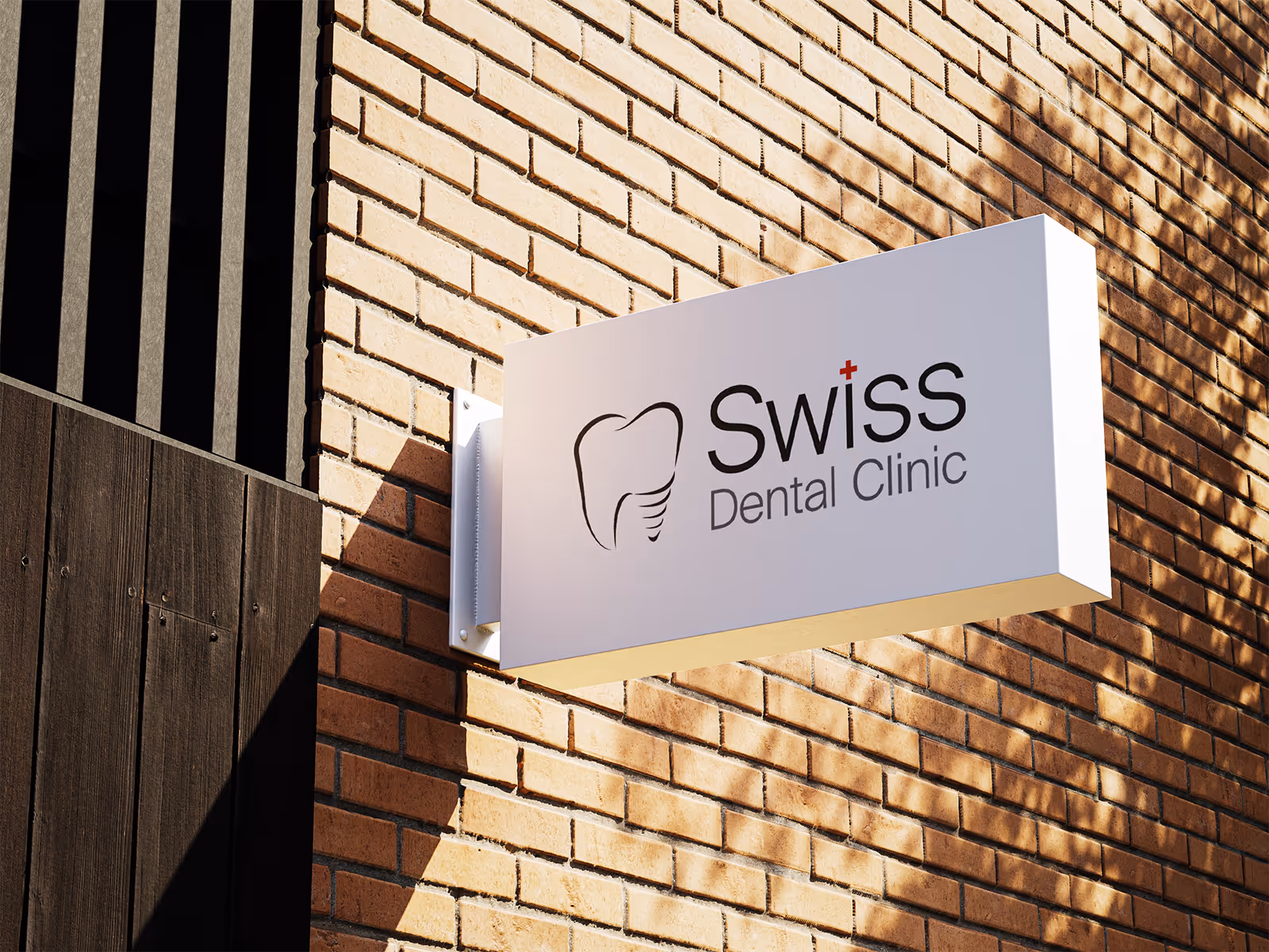
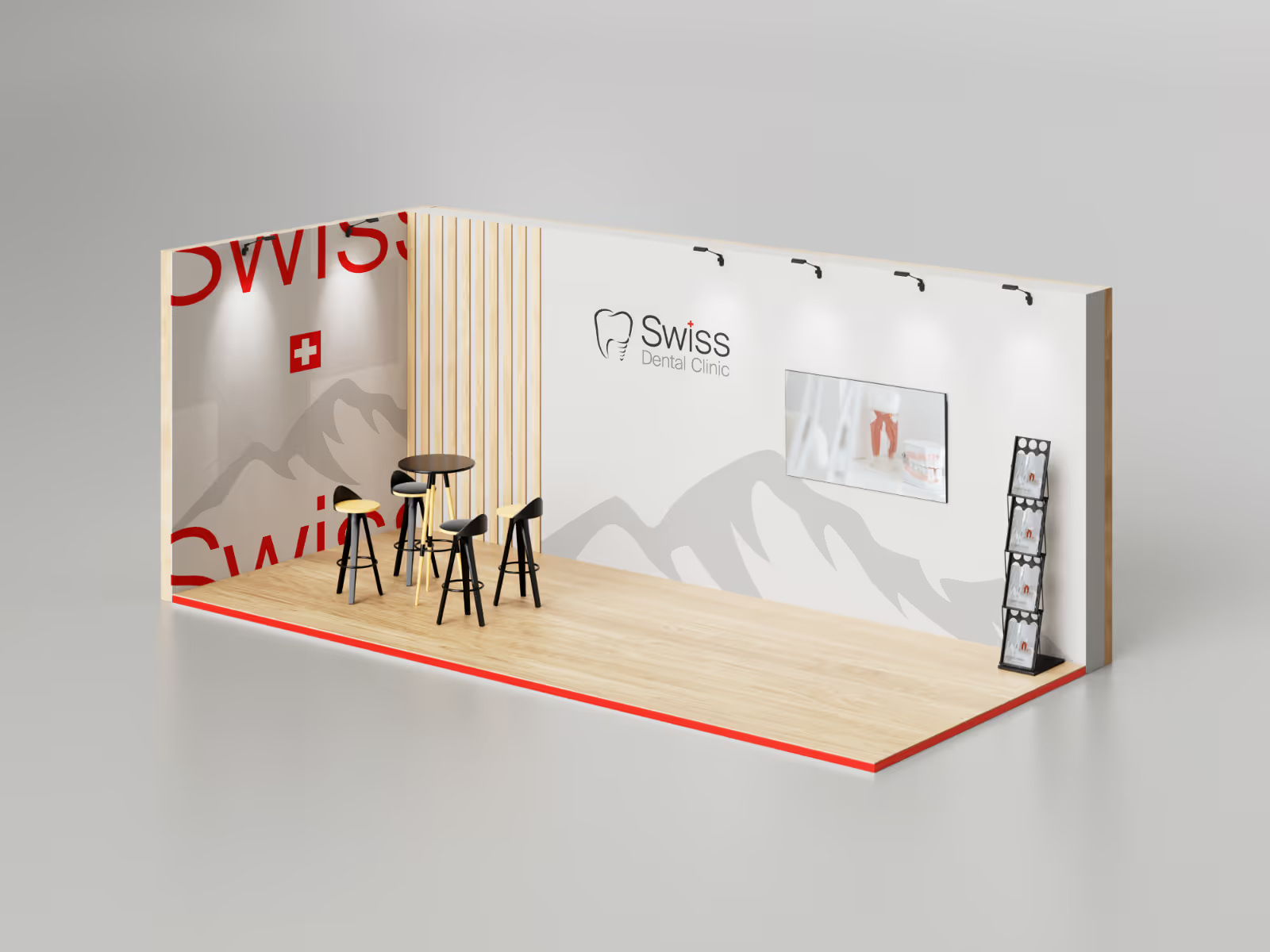
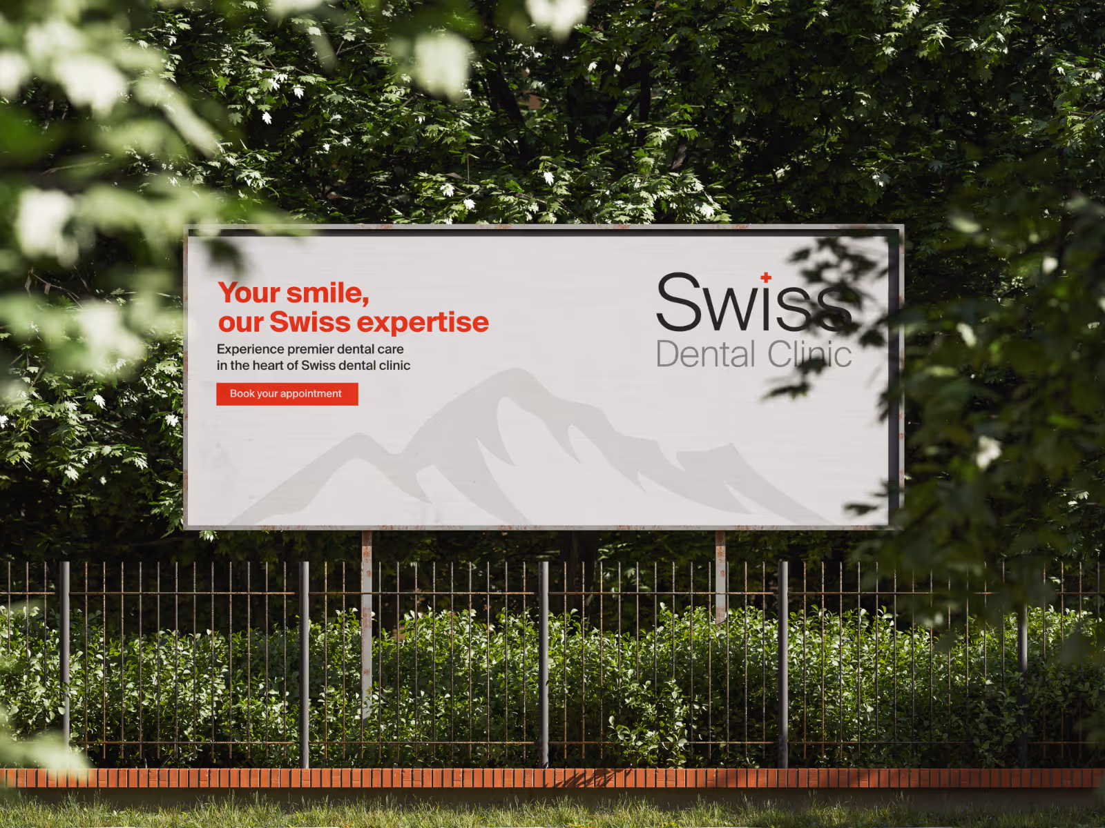
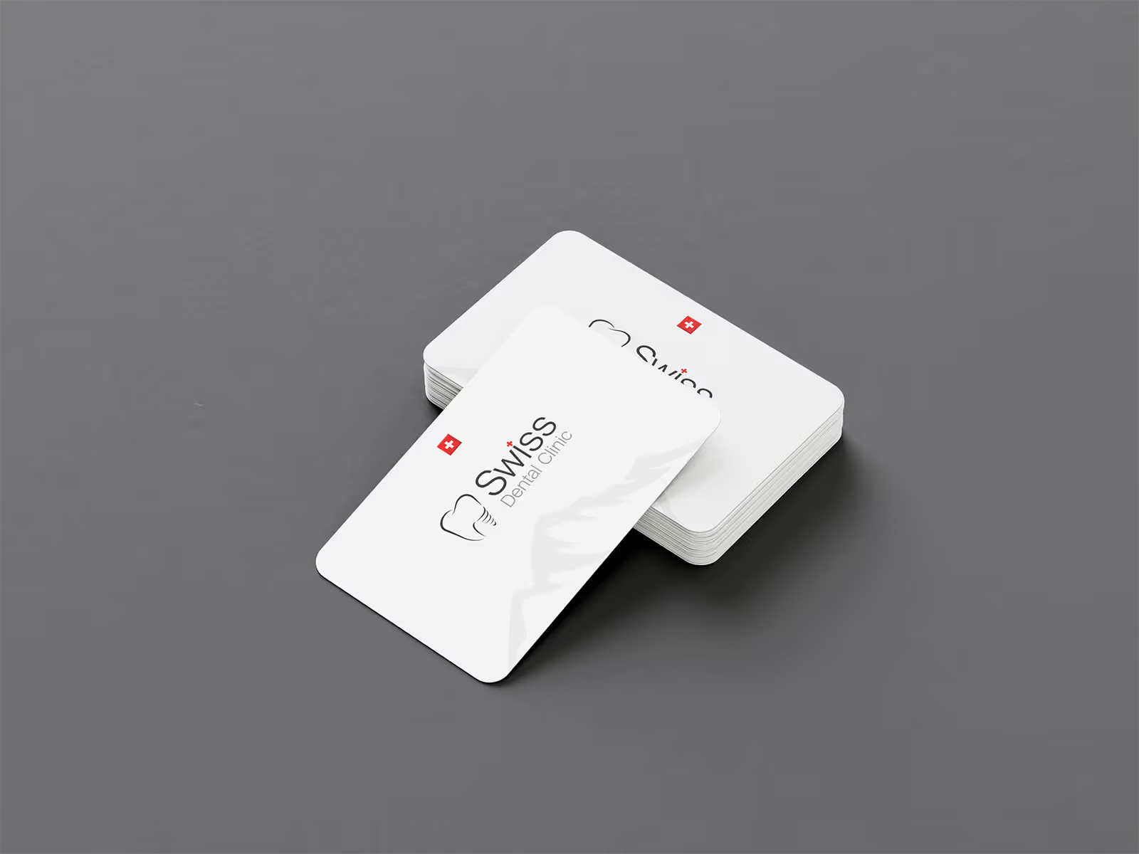
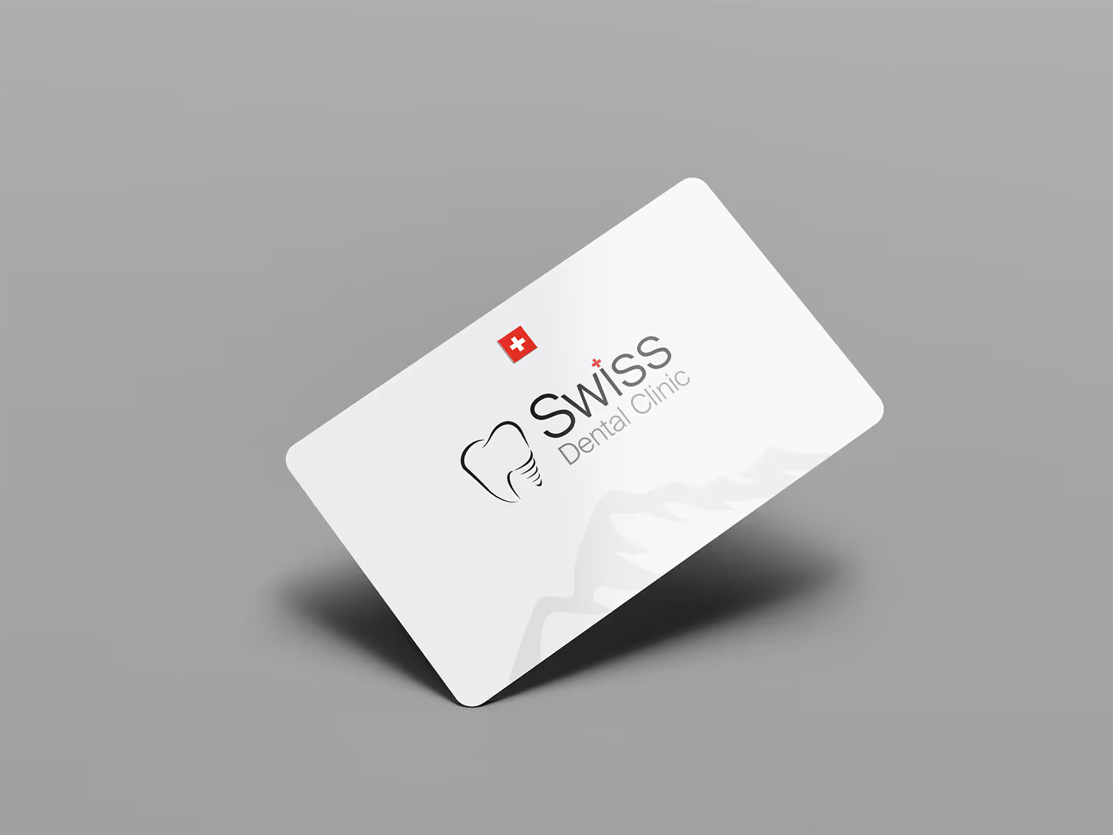
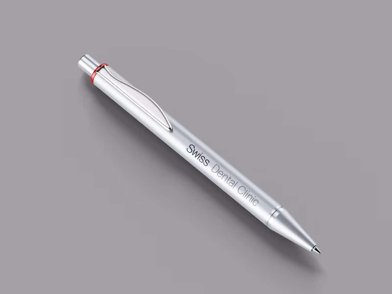
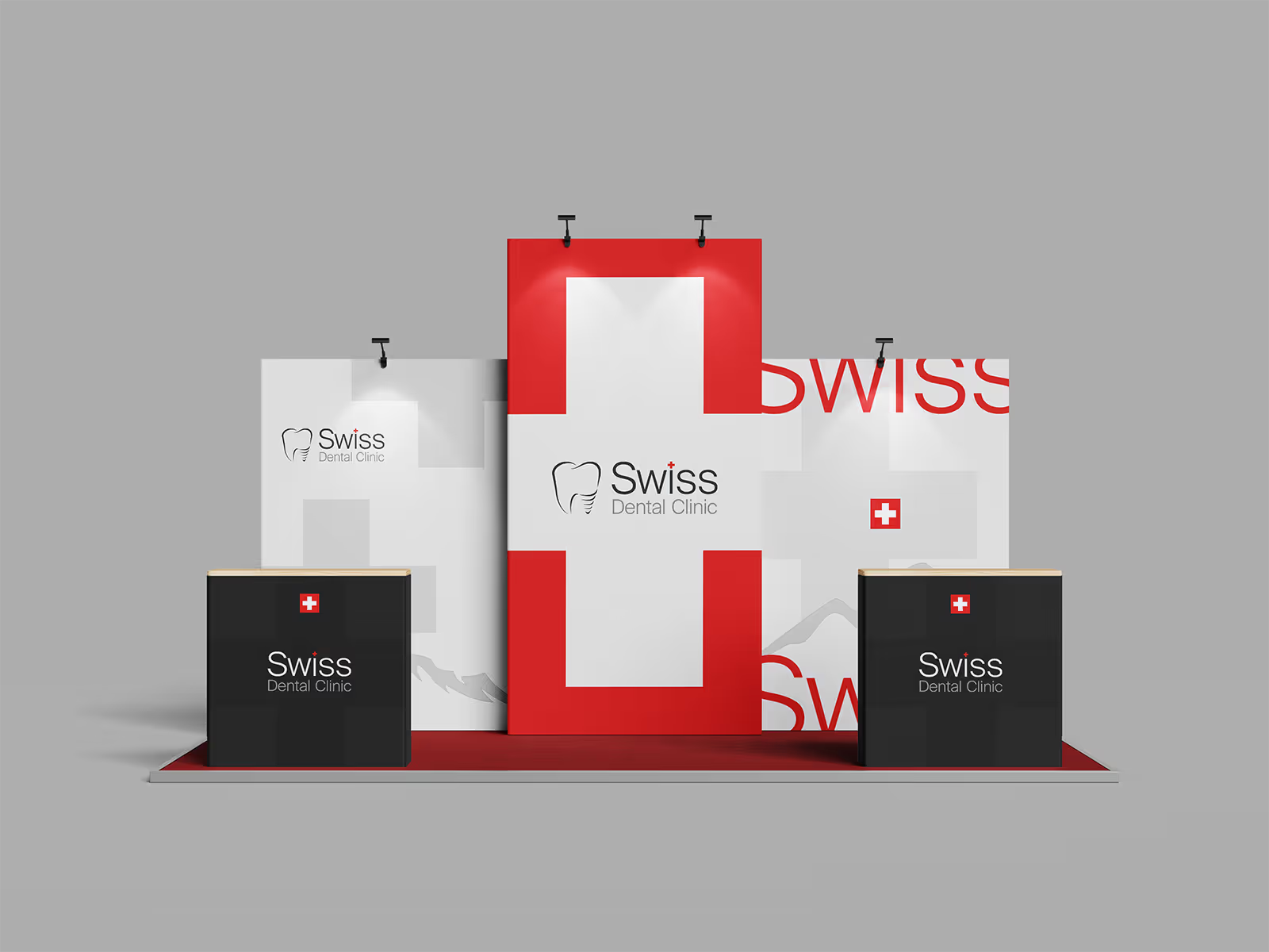
The primary objective of this project was to develop a visual identity for a dental clinic that directly reflects Swiss precision, quality, and professionalism. The result is a strong and consistent brand designed as a timeless system that instills a sense of trust, security, and premium care in patients.
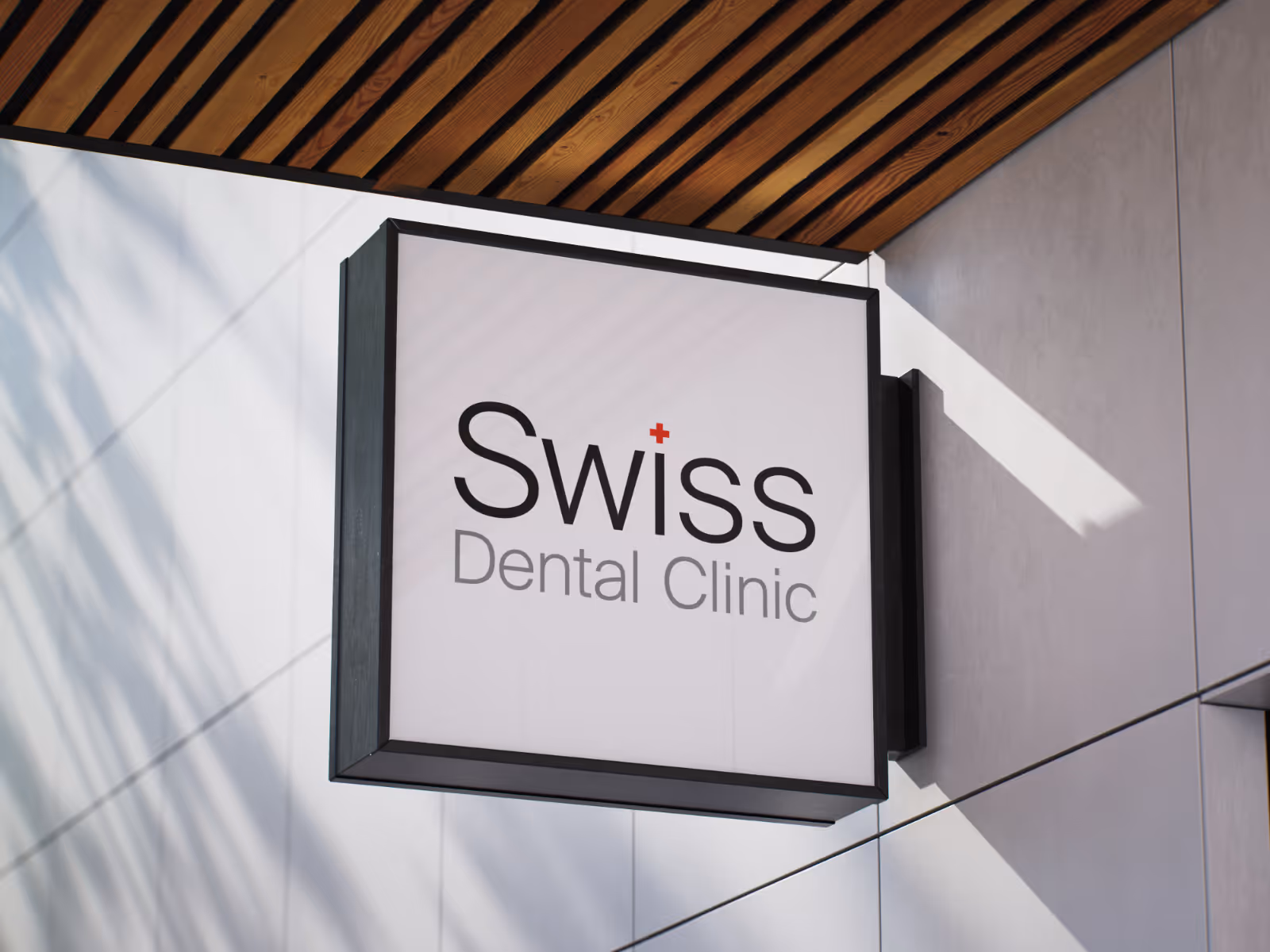
Logo
The primary logo features a clean tooth symbol with an integrated artificial implant, bridging the clinic’s expertise with a direct reference to world-class reliability.
Main font
Suisse Int'l
Aa
A a B b C c D d E e F f G g H h I i J j K k L l M m N n O o P p Q q R r S s T t U u V v W w X x Y y Z z 1 2 3 4 5 6 7 8 9
Regular
Colors
The palette of white and gray provides a clean, hygienic foundation, while Swiss Red is used sparingly as a premium accent to guide attention and enhance brand credibility.
The heritage

Subtle Alpine silhouettes with low opacity are used as background textures, grounding the brand in its heritage while adding a sense of depth without cluttering the cleanaesthetic

