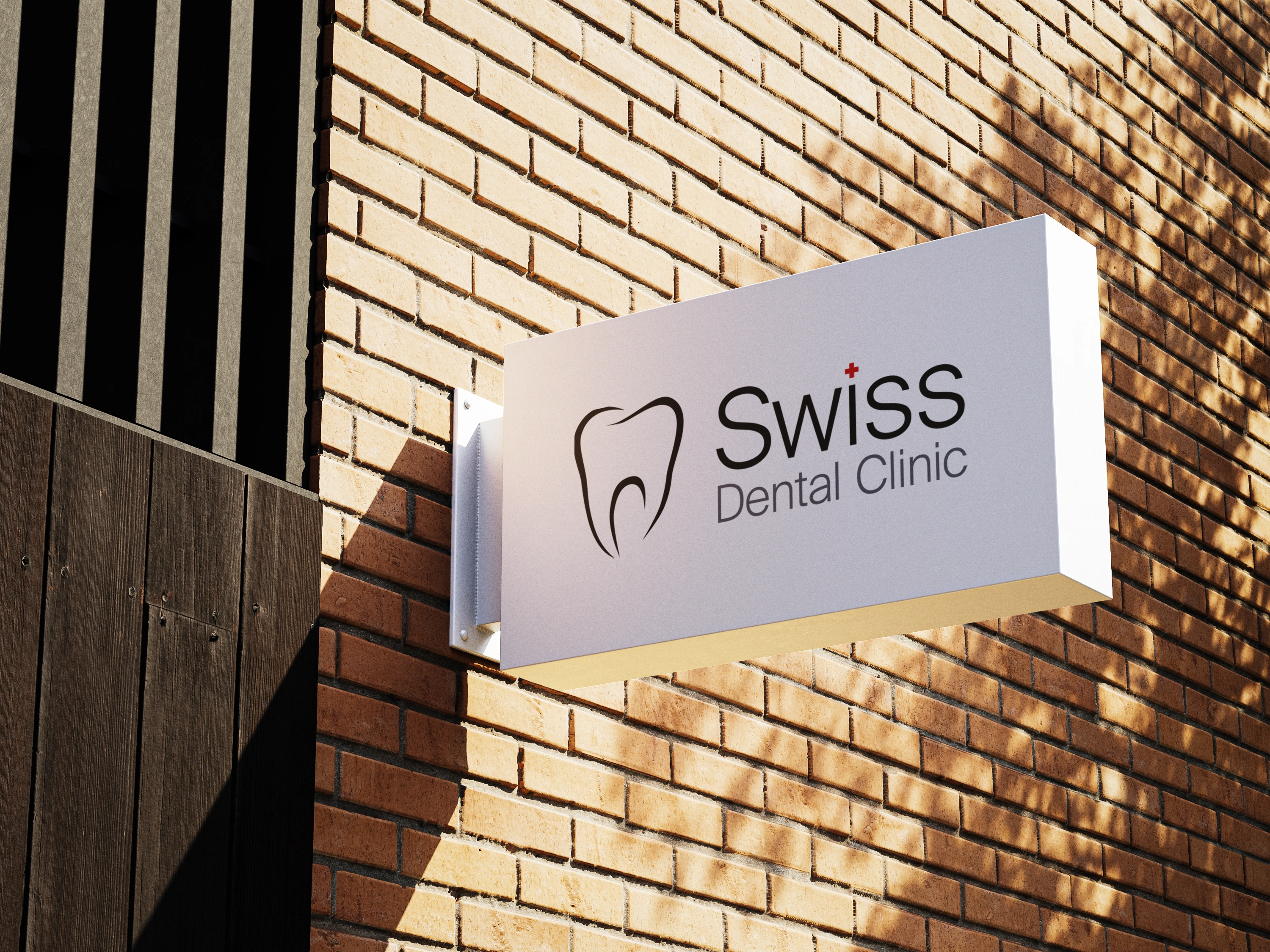
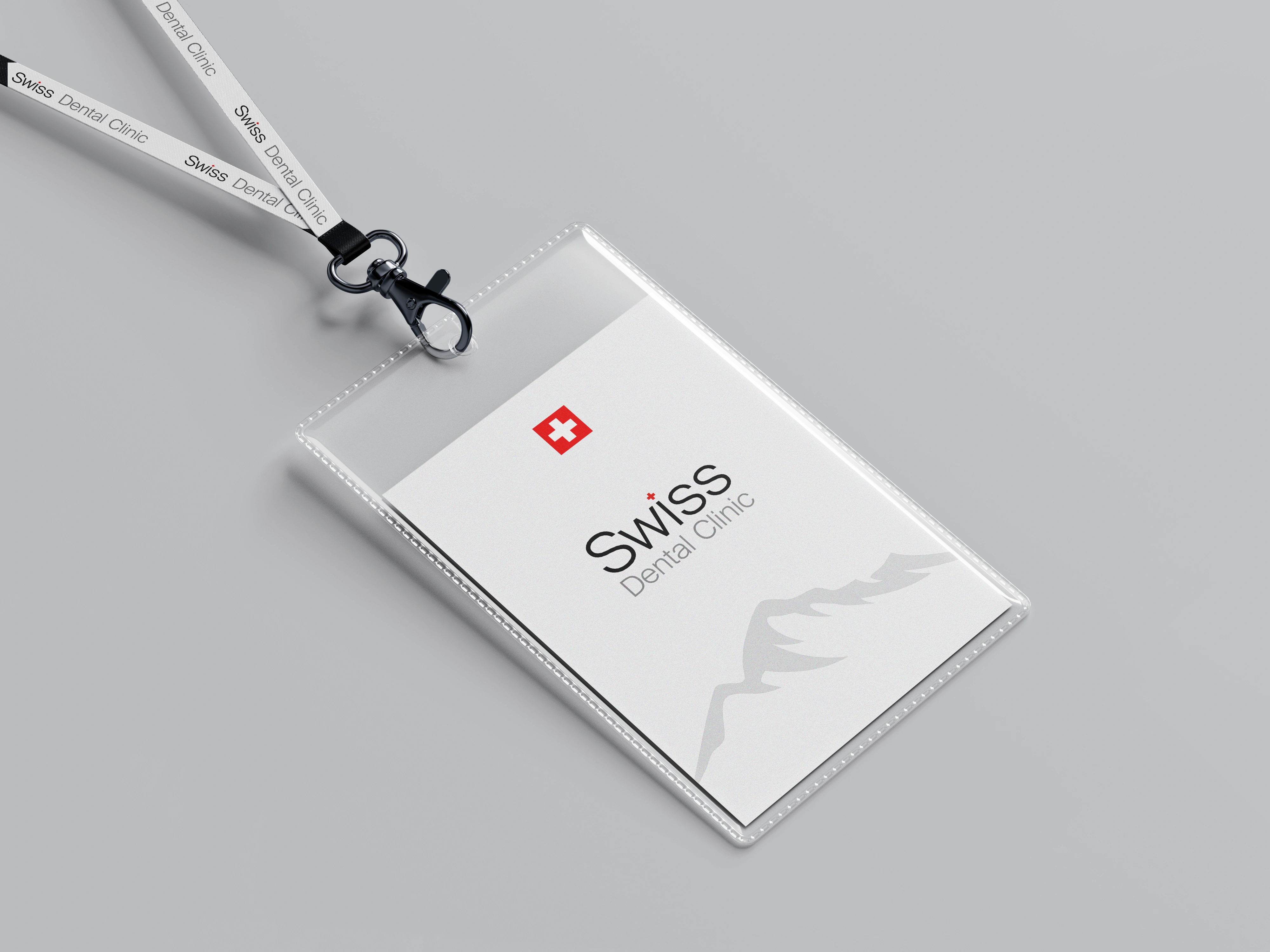
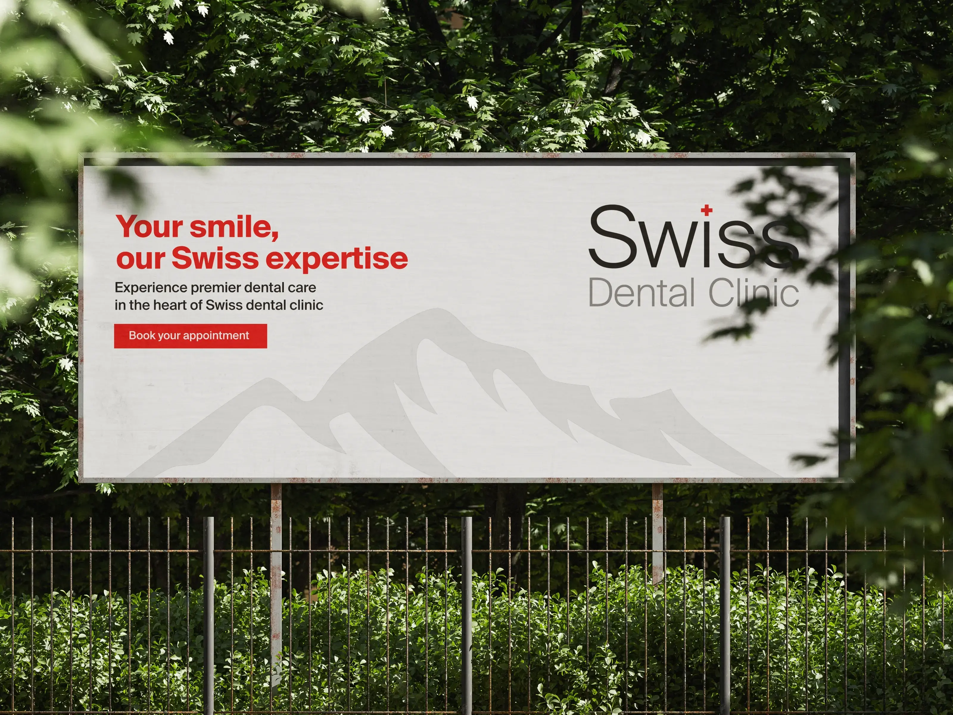
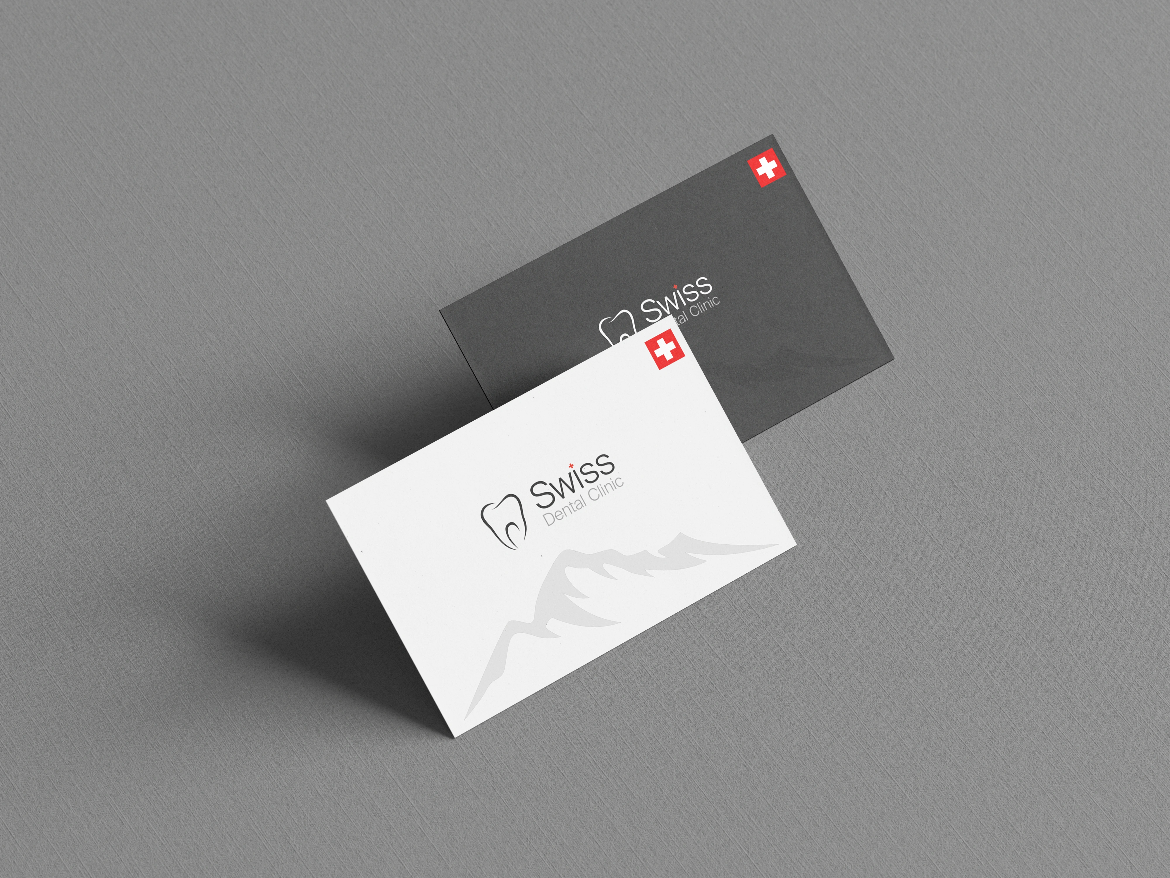
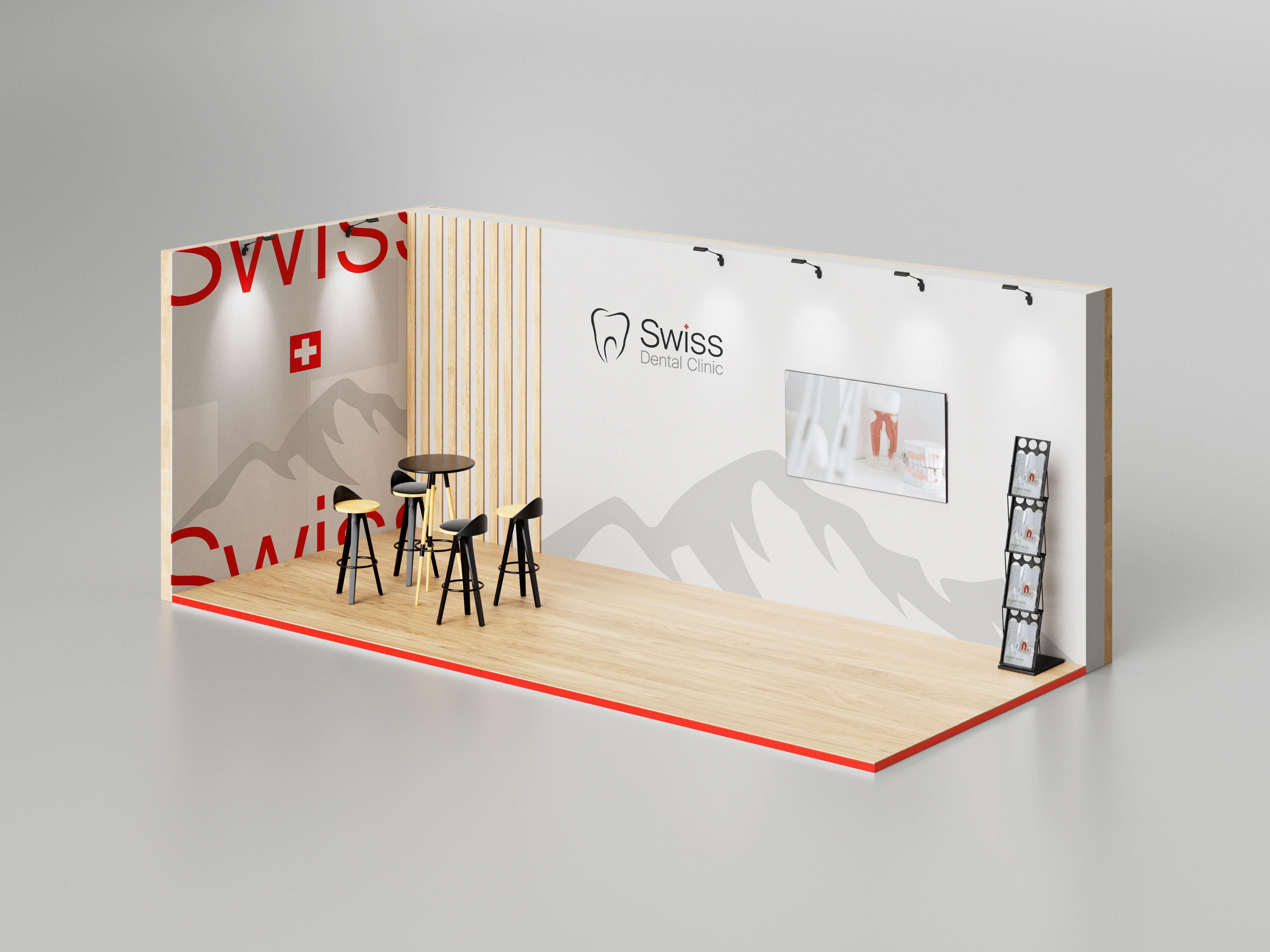
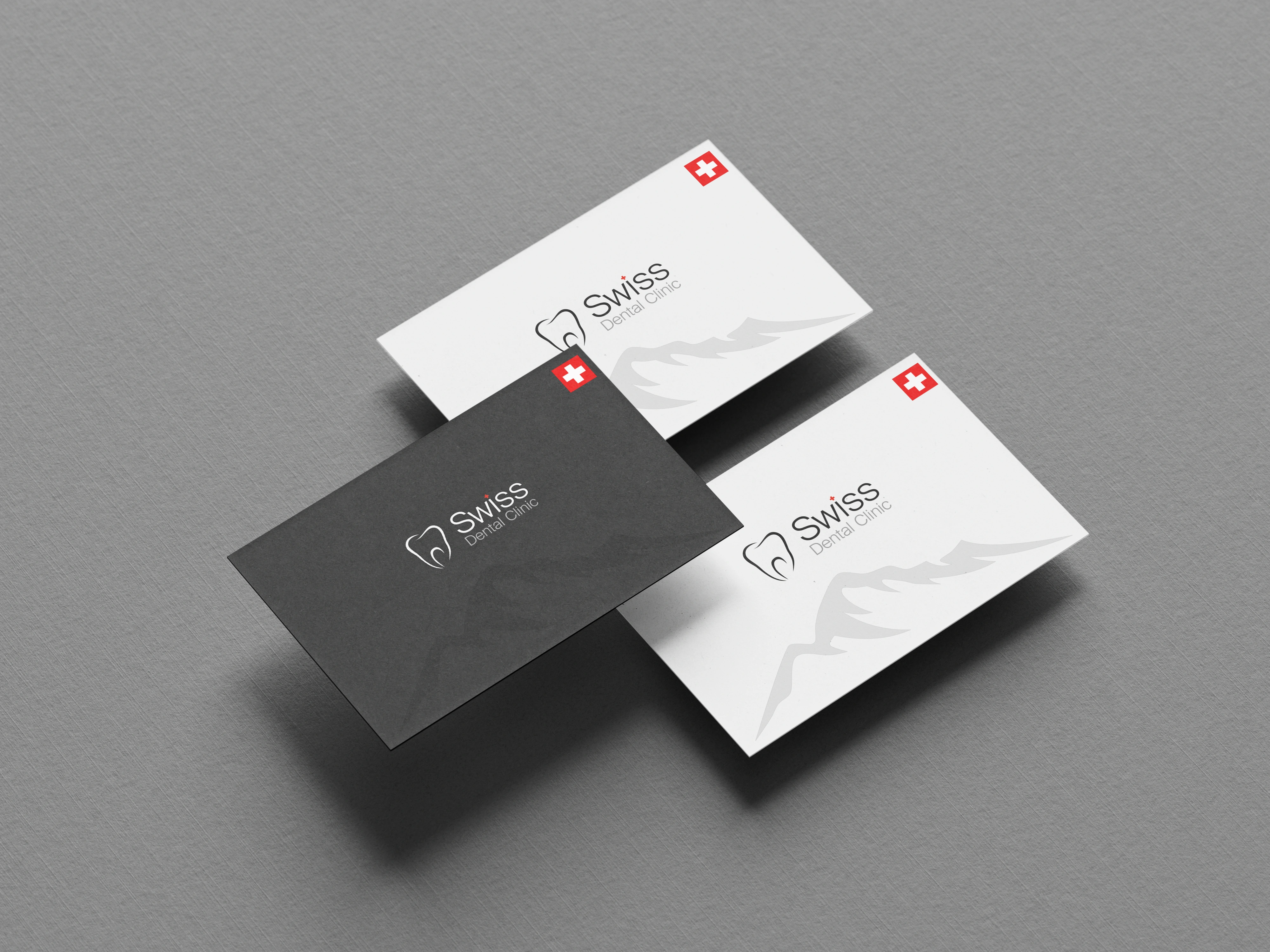
Rooted in the principles of Swiss minimalism and clear structure, the identity avoids unnecessary visual effects to maintain a calm and highly professional tone.
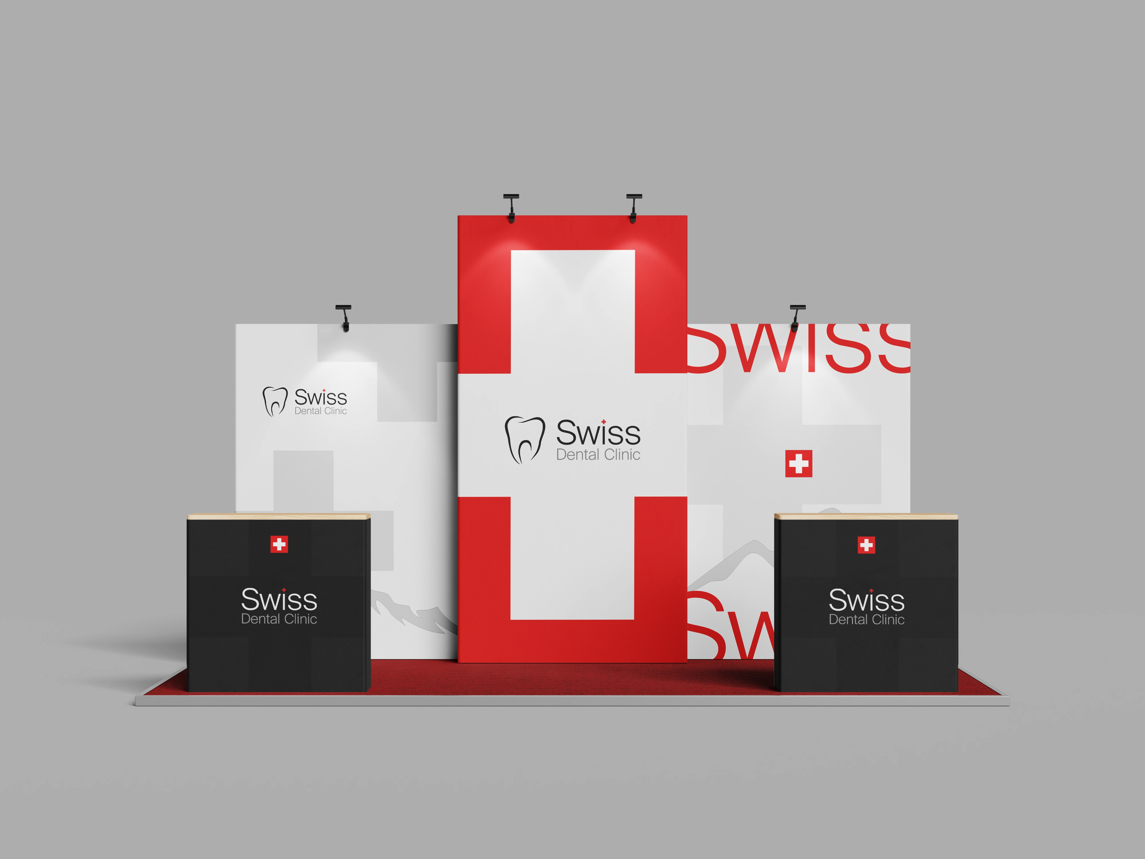
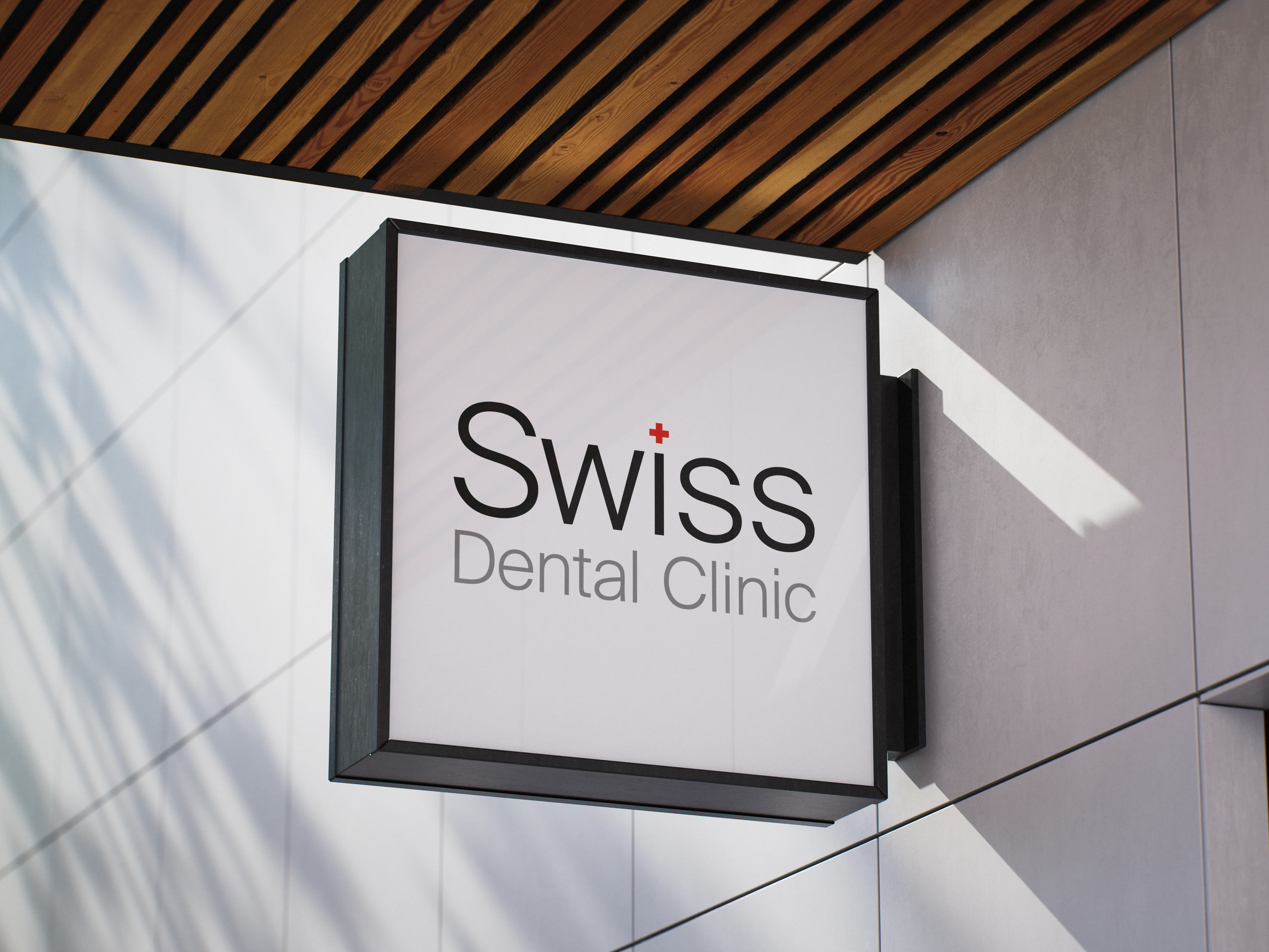
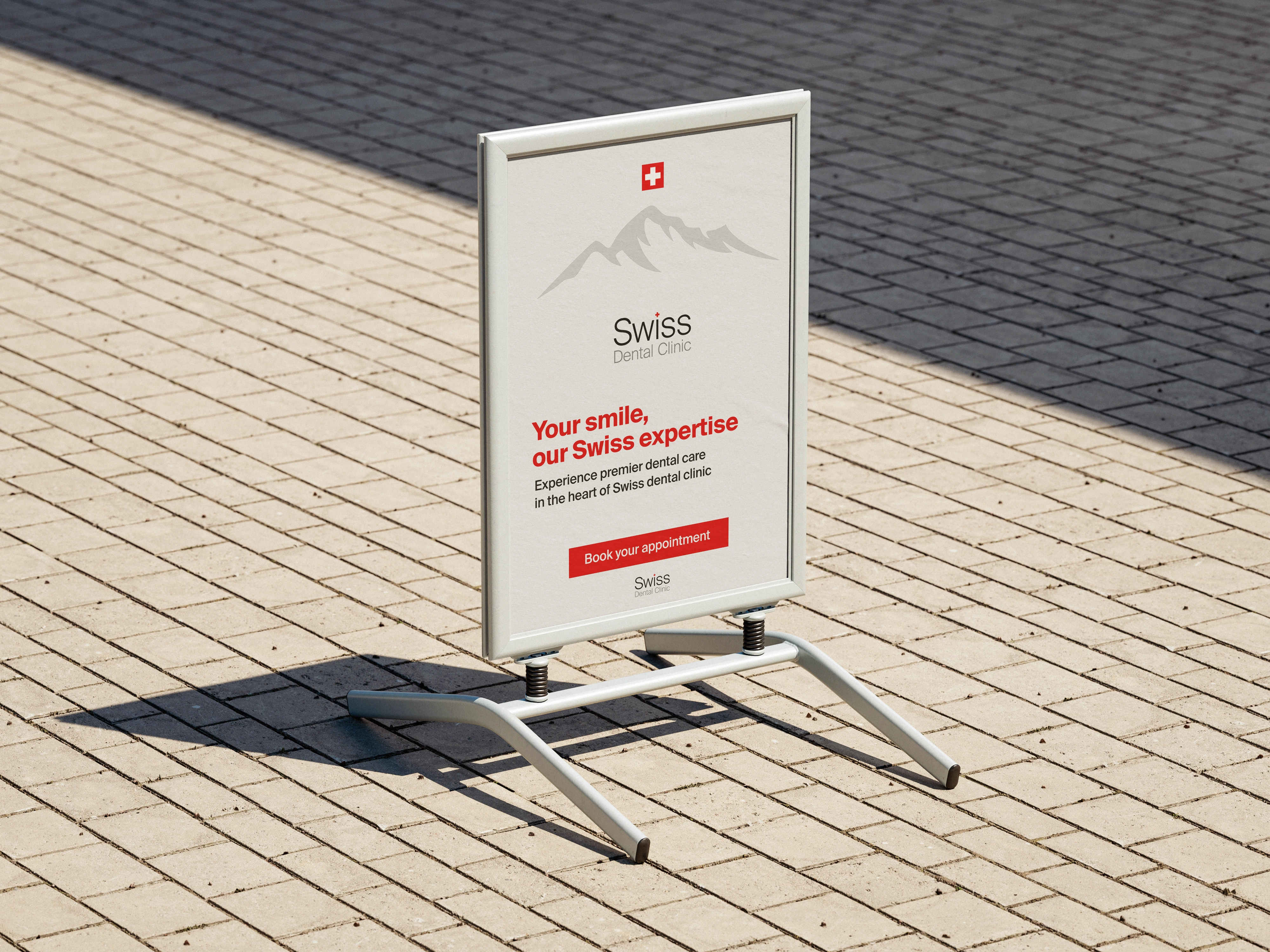
The primary logo features a geometrically clean tooth symbol with an integrated Swiss cross, bridging the clinic’s expertise with a direct reference to world-class reliability.
This is complemented by a modern sans-serif typeface where a heavier weight emphasizes "Swiss" and a lighter weight adds elegance to "Dental Clinic," ensuring a clear hierarchy.
The palette of white and gray provides a clean, hygienic foundation, while Swiss Red is used sparingly as a premium accent to guide attention and enhance brand credibility.