PoMedzi
client
PoMedzi
my role
Brand identity
Social media
Ongoing project
00-1 /
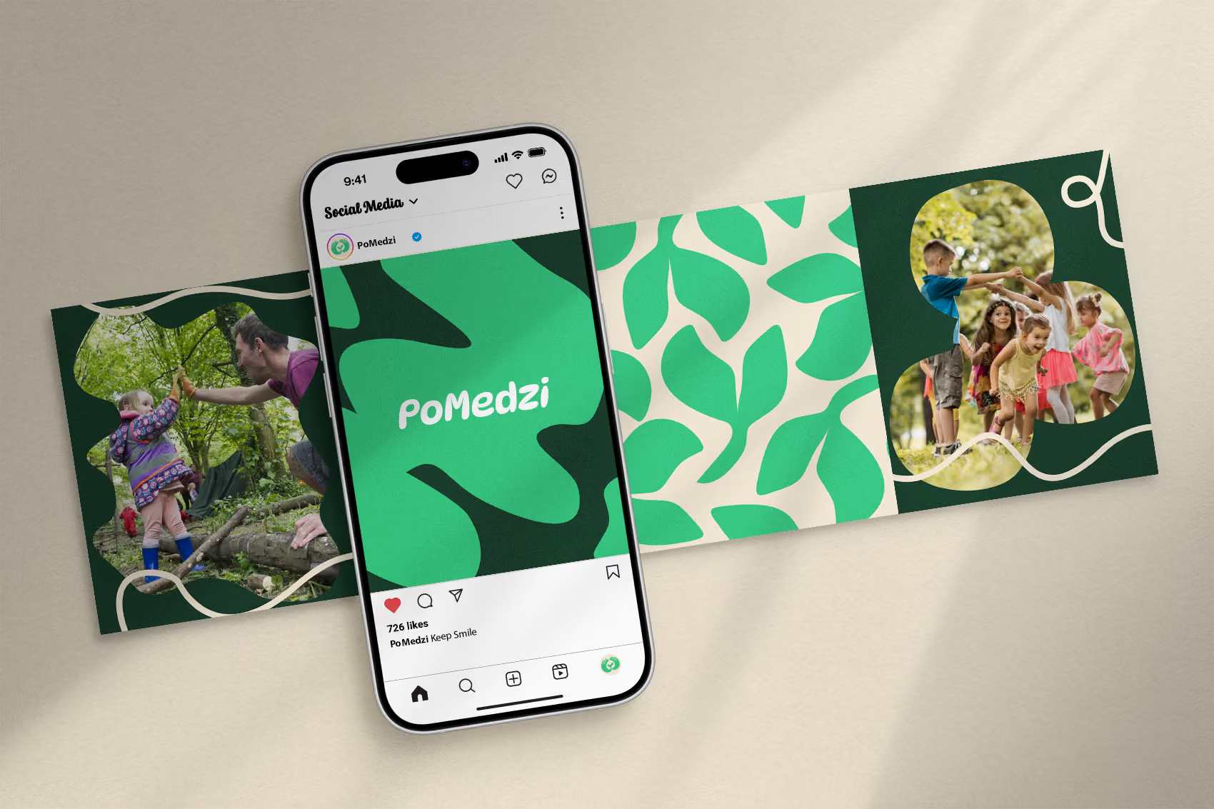
The primary objective of this project was to develop a visual identity for an educational non-governmental organization that directly reflects experiential learning, curiosity, and a deep connection to nature. The result is a warm and organic brand designed as an inviting system that instills a sense of discovery, community, and active environmental exploration in both children and adults.

00-2 /
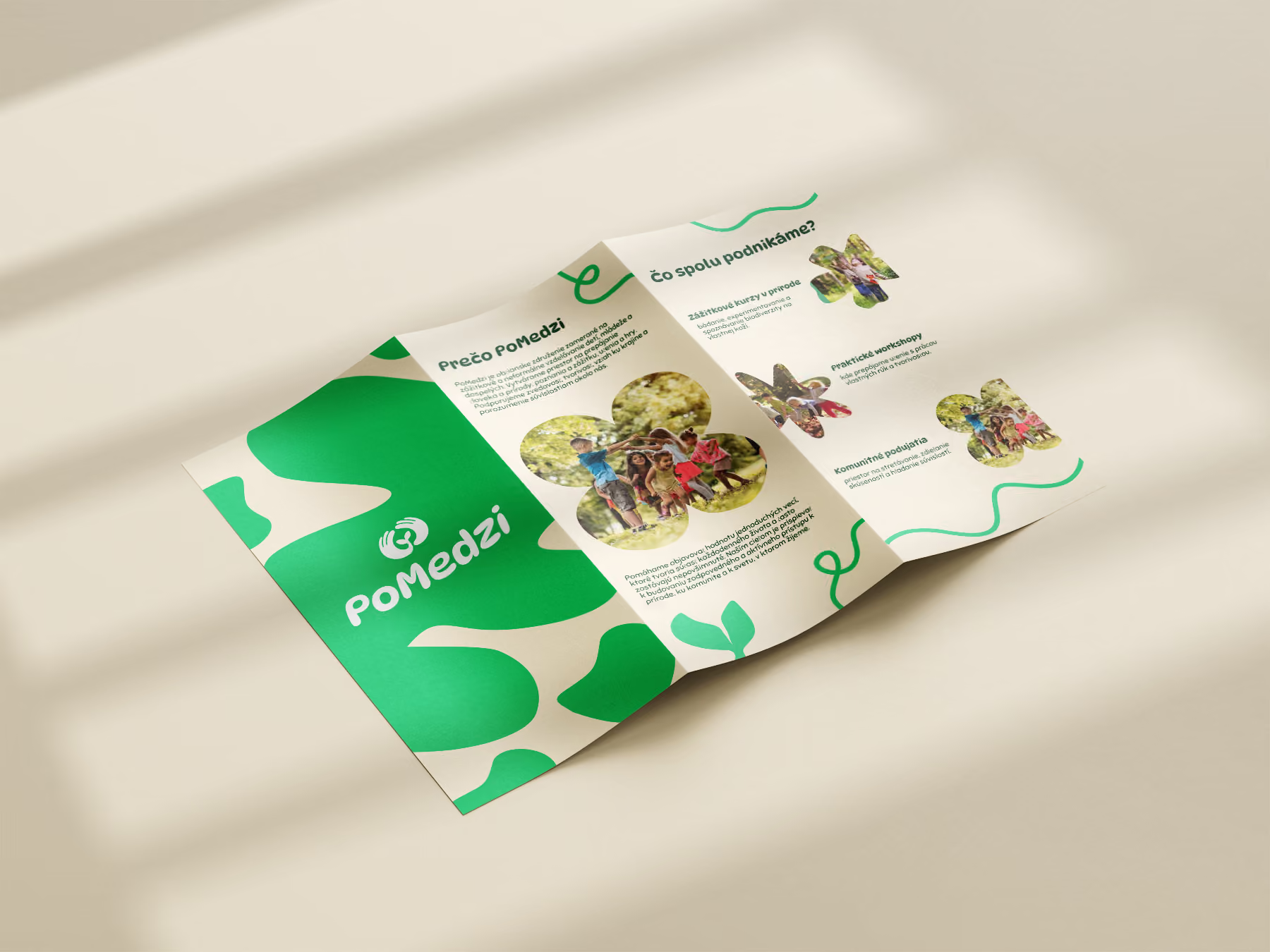
The logotype for PoMedzi integrates raw typographic simplicity with a clever, interconnected ligature between the middle letters to anchor the brand in the concept of transitional space and shared connections. It rejects digital perfection, allowing the soft geometry and custom line flows to instantly communicate accessible education, hands-on experiences, and the rich biodiversity found within natural boundaries.

00-3 /
DynaPuff
Aa
A a B b C c D d E e F f G g H h I i J j K k L l M m N n O o P p Q q R r S s T t U u V v W w X x Y y Z z
Regular
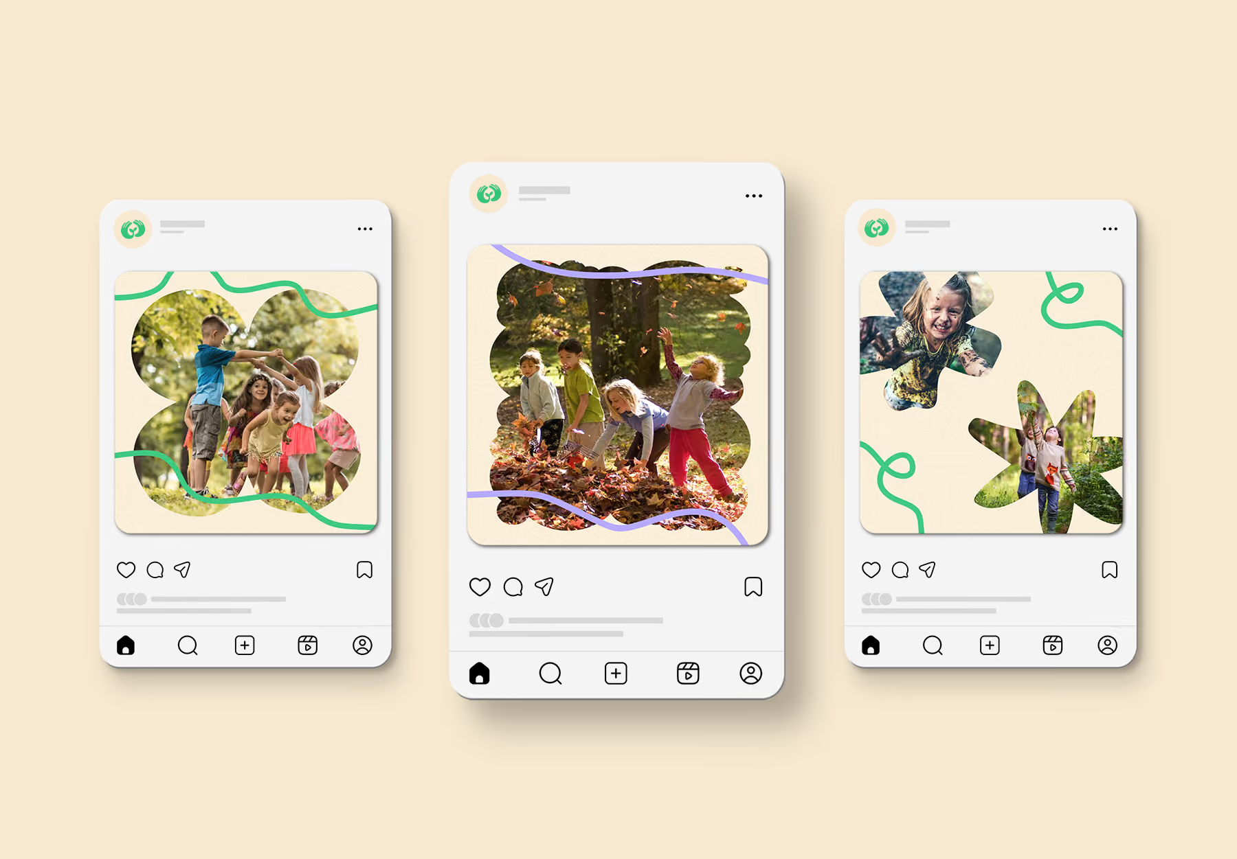

The palette of warm cream and sage green provides a calm, rustic foundation inspired by recycled textures and foliage, while soft lavender are used as playful, vibrant accents to guide attention and enhance the brand's creative energy across digital media and event graphics.


LET'S CREATE TOGETHER
Contact


© Matus Kosecek 2026