Slávia UK
Project goal
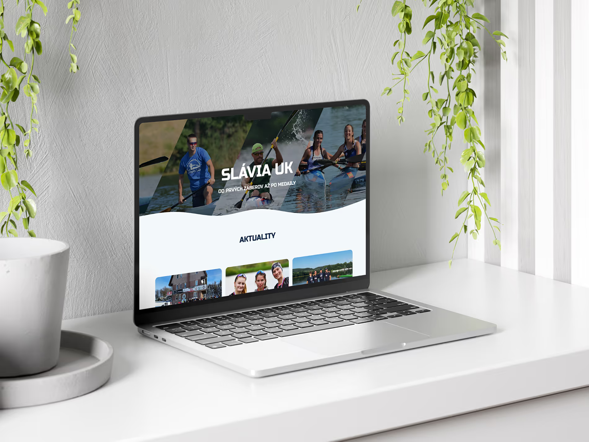
The goal of this project was to redesign and develop the website of the canoe club with a strong focus on clarity, usability, and content hierarchy, making key information easily accessible for athletes, parents, and club members across all devices bringing the friendly and sporty atmospehere at the same time
Design decisions
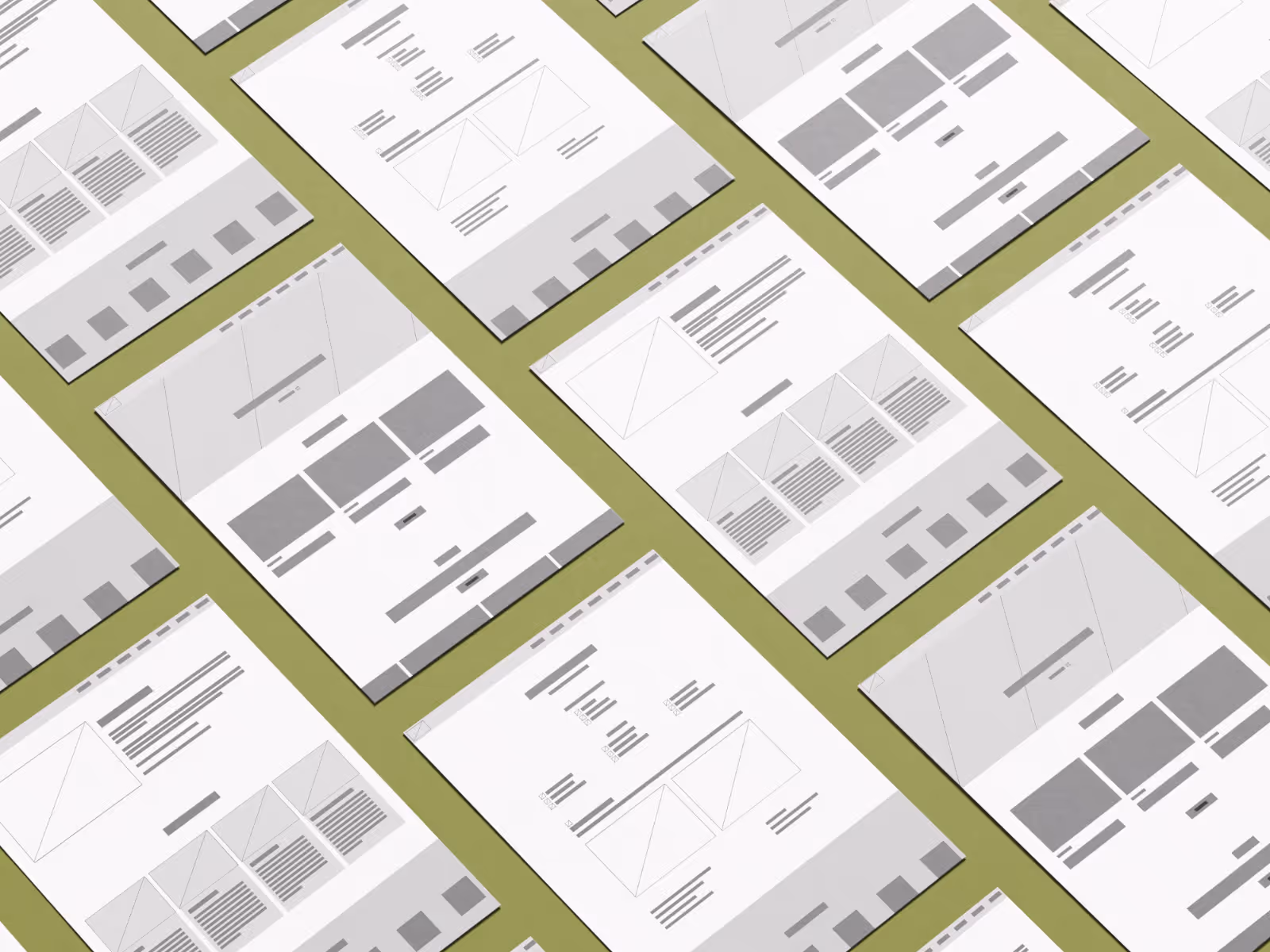
The process began with low-fidelity wireframes to define an intuitive navigation flow and content hierarchy, prioritizing fast access to key information.
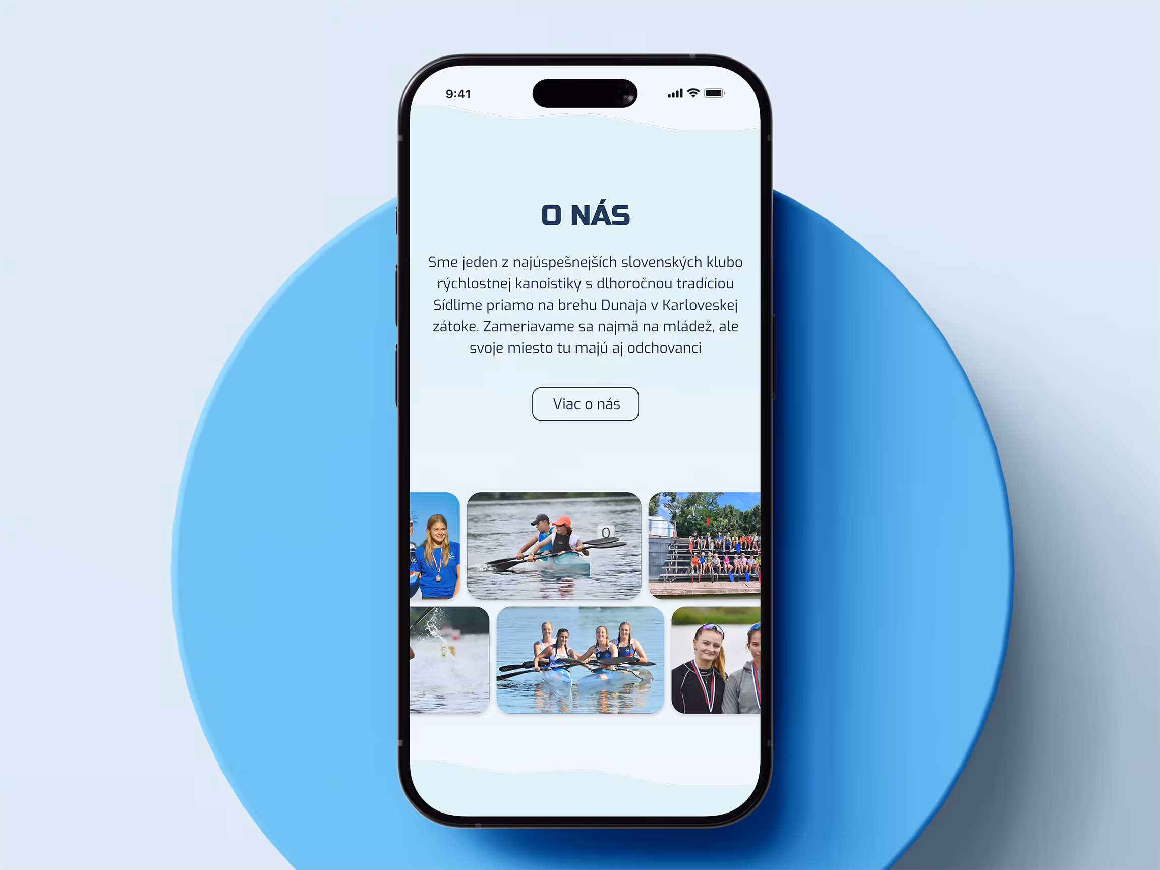
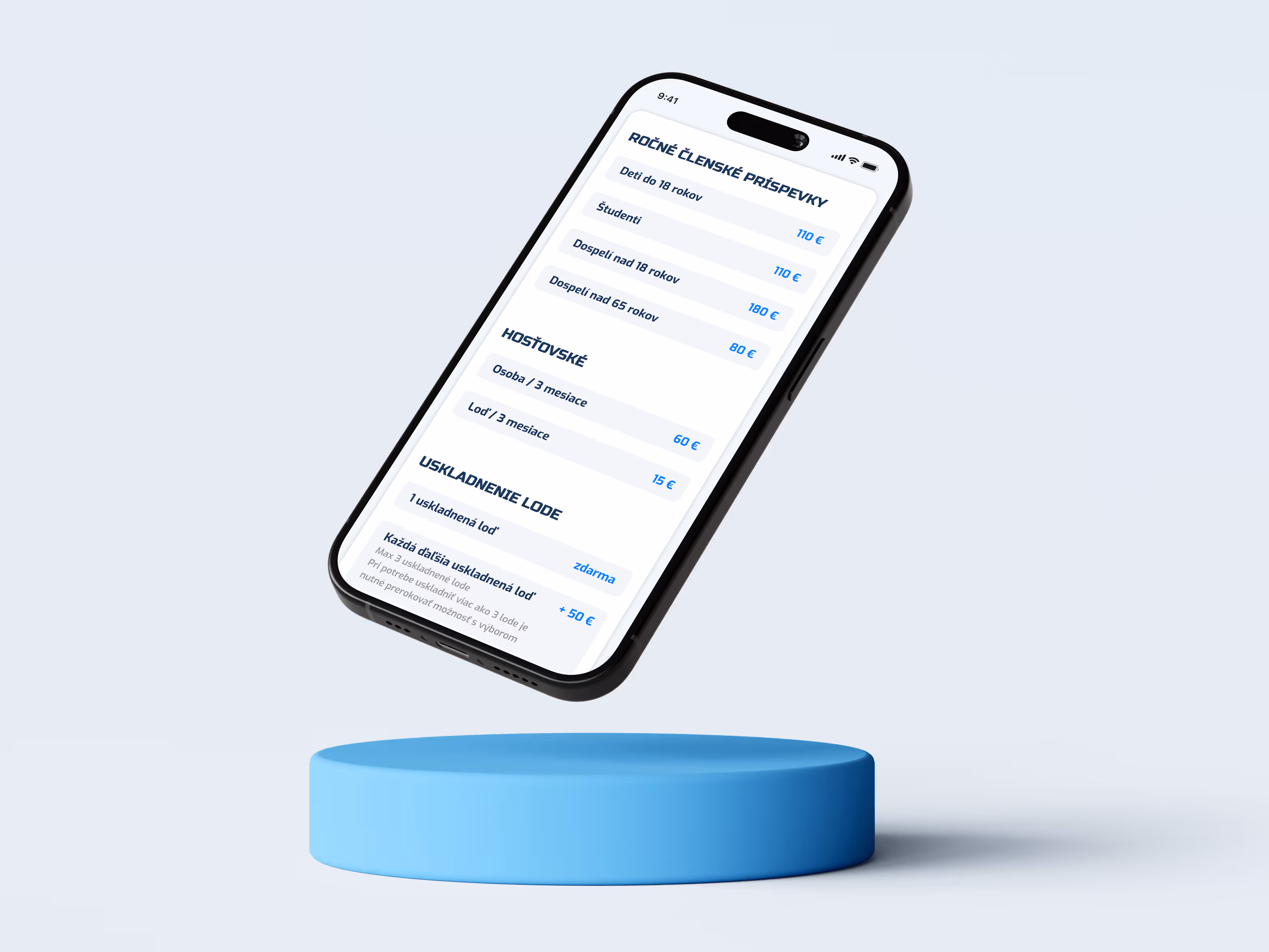
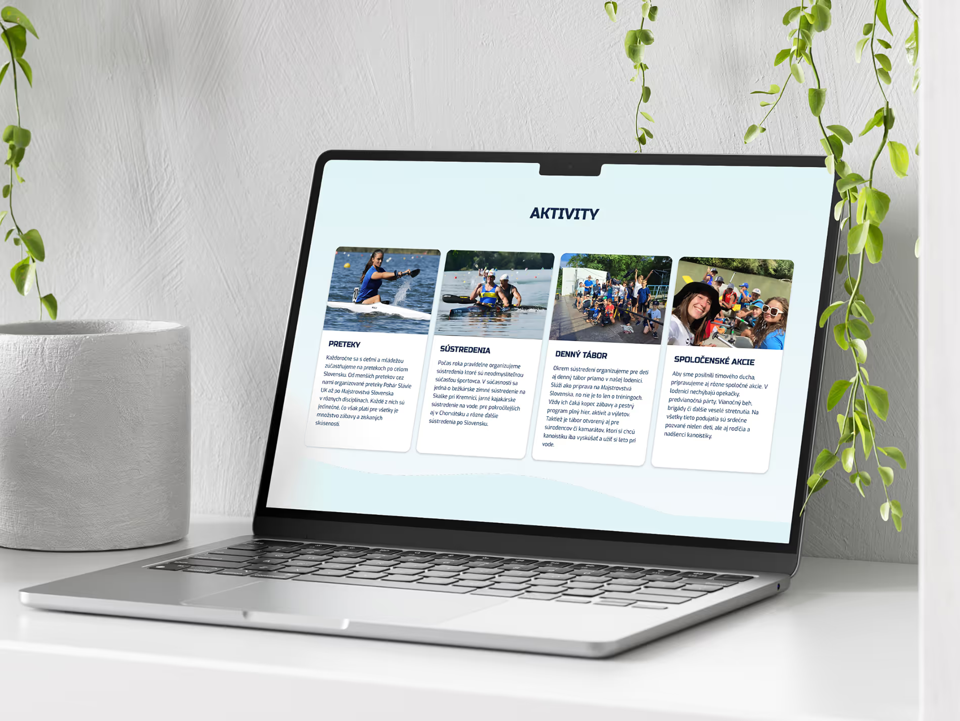
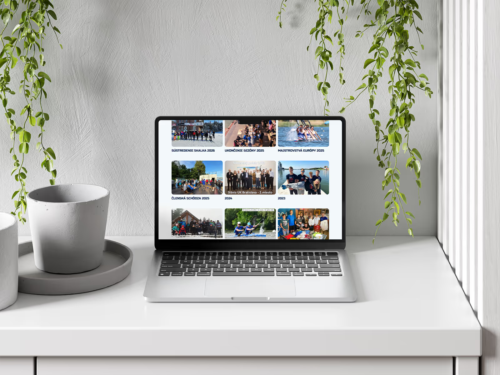
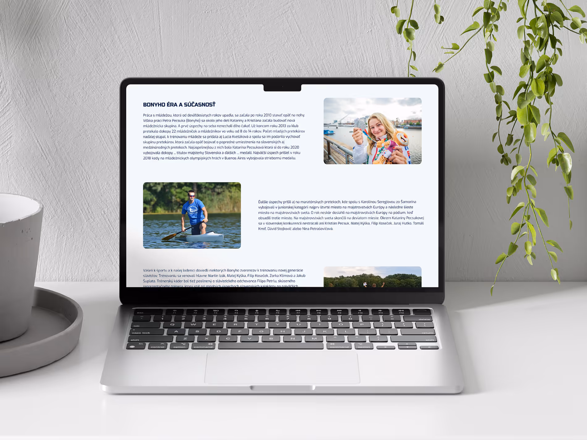
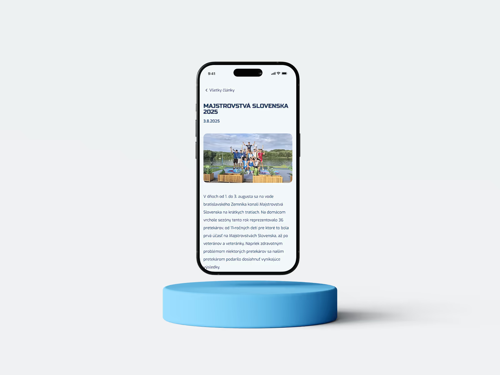
The entire interface is built on a fully responsive system, ensuring visual clarity and consistent usability from desktop to mobile.
The entire interface is built on a fully responsive system, ensuring visual clarity and consistent usability from desktop to mobile.
Colors


The visual identity creates a synergy between a friendly palette and athletic energy, using a light blue foundation that evokes water under a clear sky, complemented by subtle wave-shaped elements. This is balanced by a dark blue contrast and a bold typographic font pairing, bringing strength and movement to the website.
Main font
Exo
Aa
A a B b C c D d E e F f G g H h I i J j K k L l M m N n O o P p Q q R r S s T t U u V v W w X x Y y Z z 1 2 3 4 5 6 7 8 9
Regular
Outcomes
Users are able to find the information they are looking for 27% faster thanks to improved structure and hierarchy.
Mobile usability increased by 35%, driven by simplified navigation and responsive layout adjustments.
Reduced page load time by 50% faster through image compression and asset management.

