The Red Files
client
Self-concept
my role
Product design
00-1 /
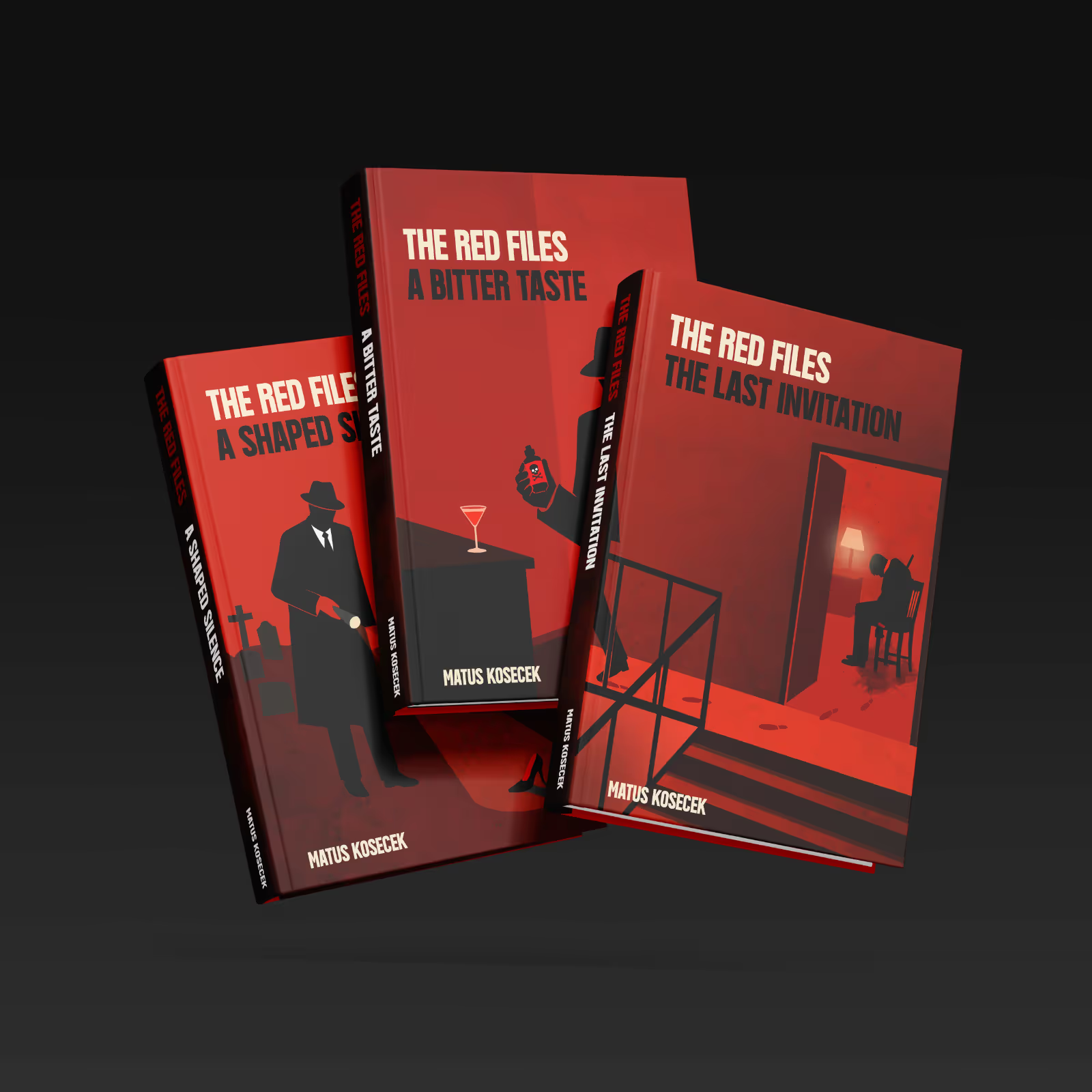
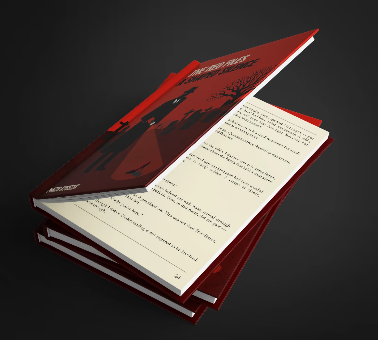
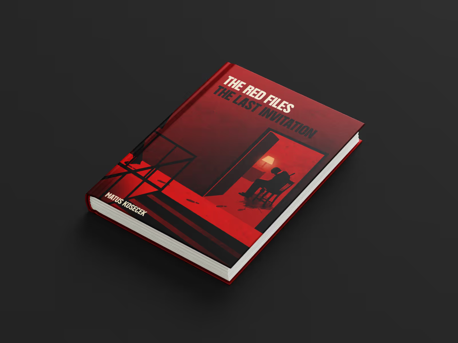
The goal of this concept project was to create a compelling series of book covers for The Red Files detective stories — evoking classic noir mystery, suspense, and danger while capturing the tense, shadowy atmosphere of crime fiction.
00-2 /
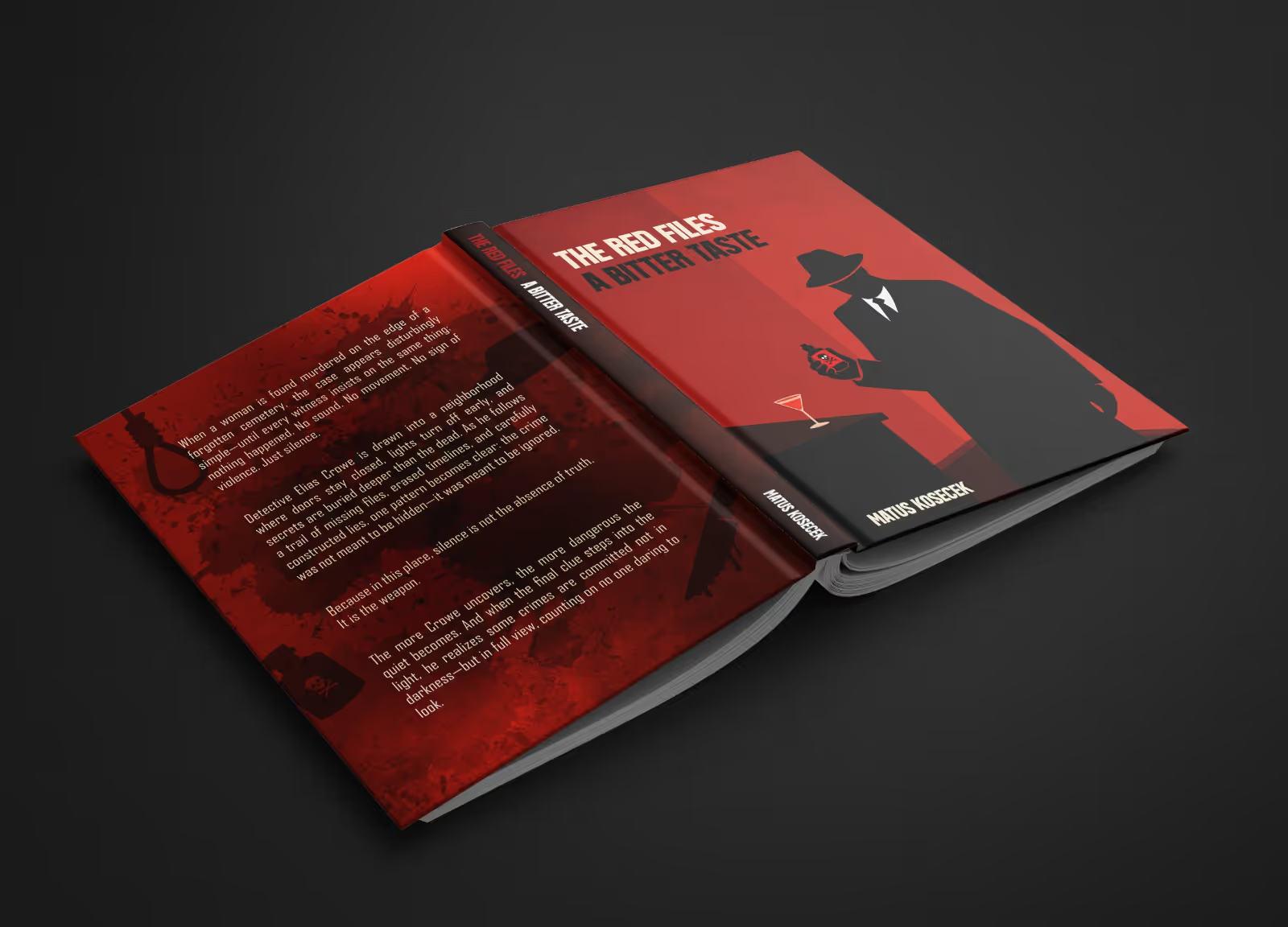
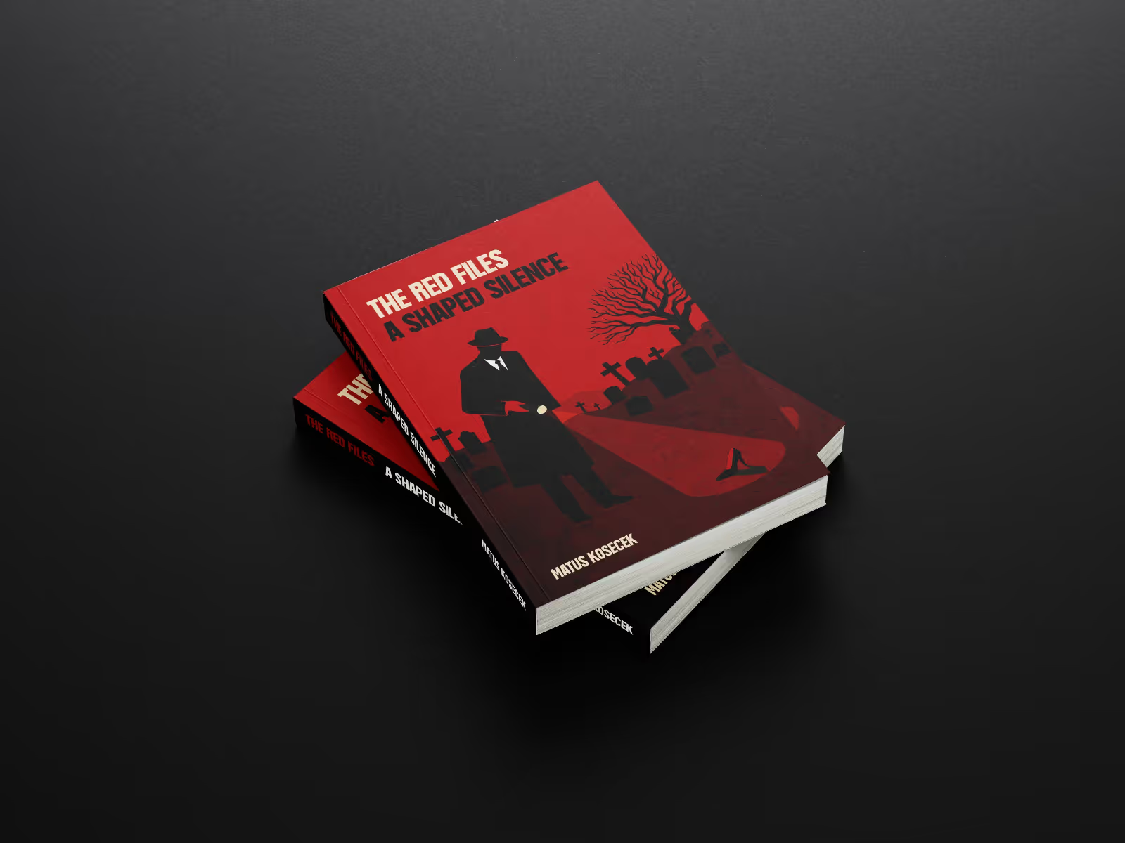
The mysterious, cinematic atmosphere is achieved through a restricted, high-contrast color palette of deep crimson red, stark blacks, and muted cream accents, mimicking the heavy, dramatic shadows of classic film noir. The layout works with distorted spatial proportions and unsettling angles to create an immediate sense of tension and psychological unease.
00-3 /
GC VANK
Aa
A a B b C c D d E e F f G g H h I i J j K k L l M m N n O o P p Q q R r S s T t U u V v W w X x Y y Z z
Regular
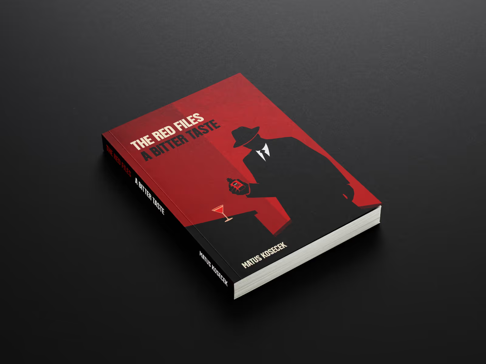
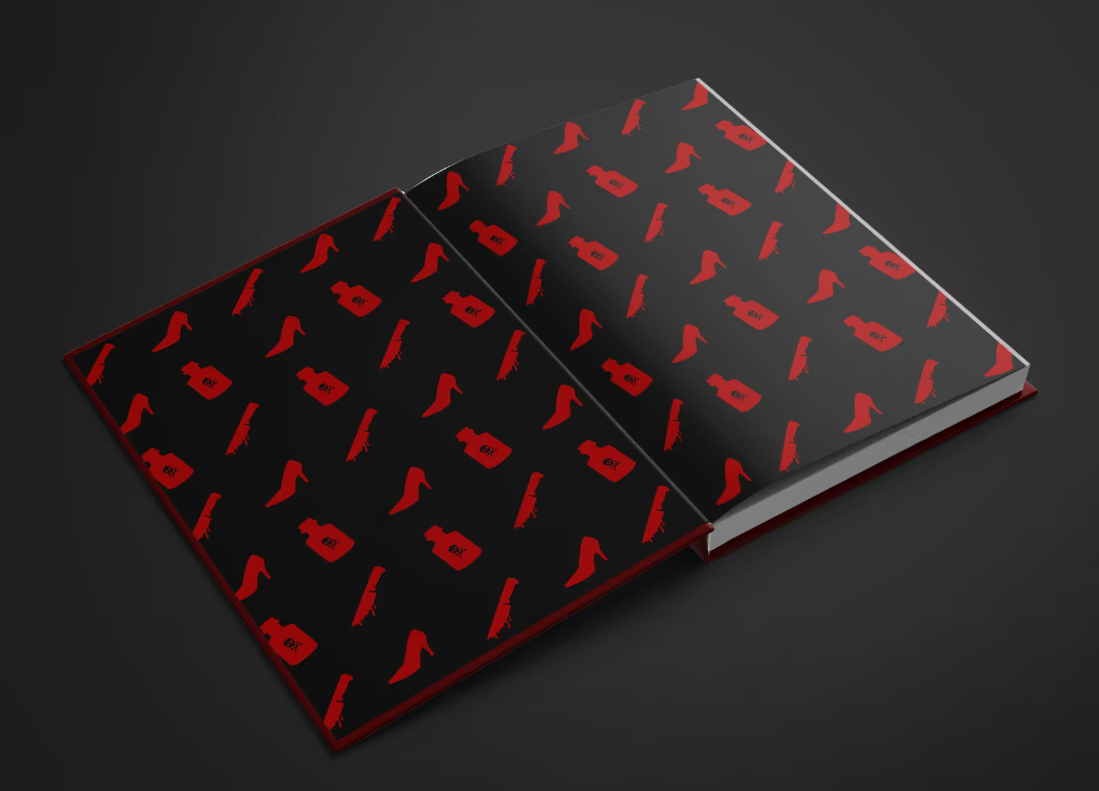
To anchor this raw visual narrative, the bold, condensed geometry of the GC VANK typeface was selected for the typography. Its heavy, industrial structure cuts through the dark, graphic shapes, ensuring absolute legibility while reinforcing the aggressive, uncompromising grit of the detective genre.


LET'S CREATE TOGETHER
Contact


© Matus Kosecek 2026